
You use the term ‘aesthetic’. You love fancy calligraphy and nice plating, and you’re all about minimalism – at least superficially. You go to IKEA and you wish you owned more plants.
We’re exposed to pretty things everywhere. The advertisements we see and apps we use everyday are made by designers who slaved away at art school. Artistic hobbies like watercolouring and photography are accessible and common, and we’re all learning how to make more aesthetically pleasing things.
This is great, for the most part. Except that: now everything is boooooring!


I don’t at all mean to offend people who actually like the aesthetics that I’m about to/have dissed. There are evolutionary, biological reasons for why we find things attractive – we all appreciate symmetry, uniformity, contrast, etc. and it’s great that these design principles are more at the fore than ever.
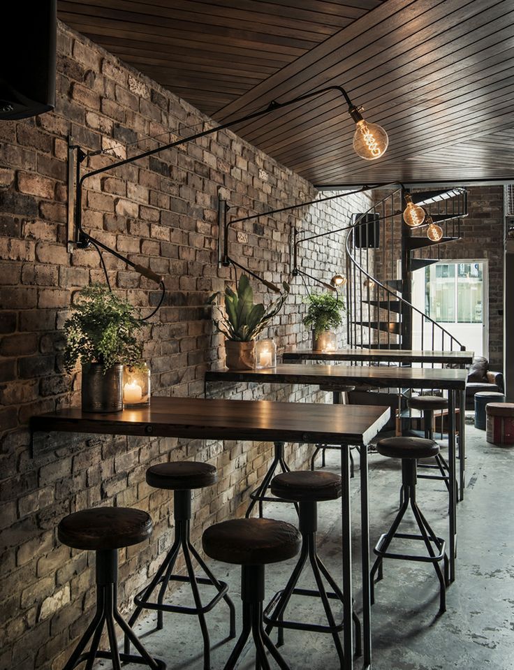
But I think I started noticing slowly how uncomfortable I was getting at the same-ness of the prettiness of everything around me. Small villages that I’d visit in England would have cafes and restaurants with menus using Courier New printed on brown paper and attached to wooden clipboards, interiors made of brick walls and dark wood floors, exposed light bulbs hanging low. They’d look exactly like the cafes in London. I don’t want to understate that it looked completely pretty and like it had been designed by a professional, but that’s also exactly the problem.
I’ve just been using interior design examples so far, but the same-ness extends far into things like app design and graphic design. It’s not like I’ve been looking out for things that look the same, but Facebook event banners strike me as very interesting data. Here I’ve adapted a Facebook banner that I saw, retaining the style it used:
This is fine.
It’s got markedly aesthetic fonts, it’s classy, it has margins, the monochromatic black-and-white keeps it tidy and adds to the mood. All in all decent.
However, am I intrigued? Do I want to go for this pasta night? No, I scrolled past this before I even processed whatever I was seeing.
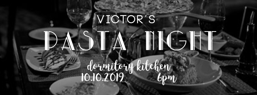
Contrast it with the below, also adapted from a real life example:

Woah there!
Now – this is a hilarious case of something that is remarkably ugly. The badly outlined image of the pseudo-Italian chef. The glow and drop shadow of the ‘Pasta night’. The odd line spacing, the bright green gradient, the “blogonese”. The random stock photos of pasta pushed up against the borders of the image.
But do you know what? It’s got my attention, and not just because it’s ugly, but because: it’s bright, distinct, and stands out. My eyes are attracted to the very clear title and details. The photos of the pasta whet my appetite. The pseudo-Italian chef beckons invitingly. I am initially repulsed, but then I am drawn into the simplicity and innocence of the design.
Cognitive dissonance is also at play here. If the banner looks so bad, it must mean that they’re much better chefs who aren’t wasting resources on design. Or if the banner is so bad, but yet I still feel myself drawn to it, it must mean that the pasta night is a really cool event.
Let’s, again, be very clear about something. There is a time and place for everything. This design would be appalling to see in a fashion magazine, or if it was used for a four star hotel’s advertising. Likewise, the previous banner would be much more appropriate in these areas. And if I was forced to print out one of these and hang it in my room, I would have to go with the “more aesthetic” one.
But for a student-organized pasta night? Yes! Hell yes!
Truly good design is situated in its context. It’s a beautiful convergence of all the factors acting upon it – audience, medium, purpose, and everything else. Even if that means it’s not, well, pretty.
So if you’re thinking about how to design your next Facebook event banner, or if you’re the one viewing it, I’d suggest thinking a little bit more and judging a little bit less. Sometimes the best thing is not one that you’ll immediately like.

Leave a comment