
WAVE
a more intuitive metronome

Role:
Creator, UI/UX designer
Date:
December 2020 / August 2022
Problem statement
I was trying to learn the bass from scratch. For any beginner, as much as you’d want to start shredding solos, you need to first start building your muscle memory and skill at a painfully slow pace.
Our internal sense of time isn’t very accurate when it comes to the second, so metronomes are key in this journey. A metronome is a device that ticks at a set beat, or tempo, that you can adjust.
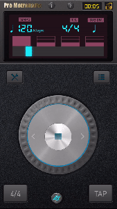
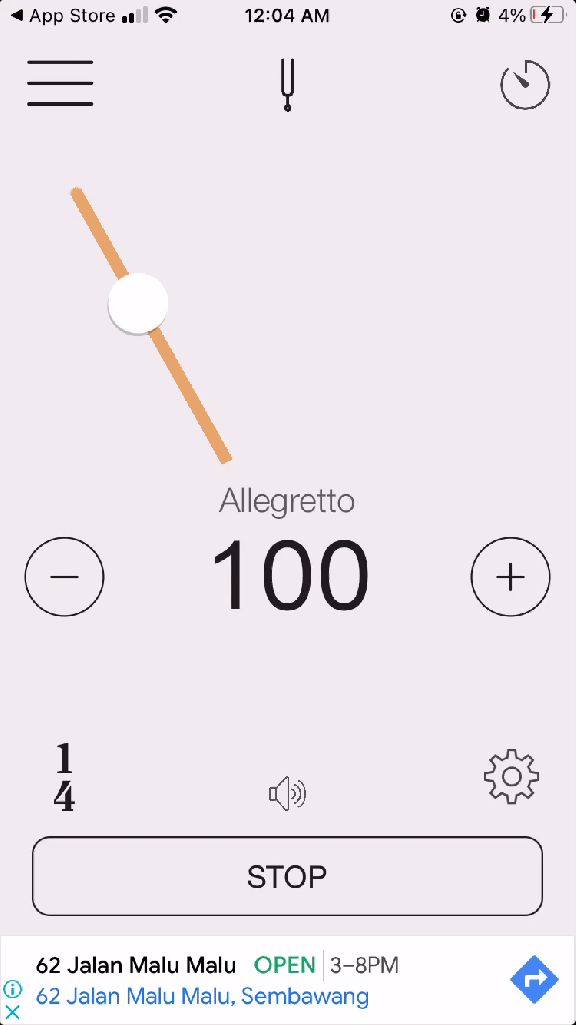
I realised that my metronome apps were not helping me anticipate accurately when the next beat would arrive. Across the top 6 metronome apps on the app store, I found these problems:
- Visual pulses did not help you predict when the next pulse will arrive.
- Visual animations did not clearly show where the beat was.
- Most metronomes had extremely cluttered, clunky UIs with too many buttons and numbers.


Research
Inspired by my own experience, I interviewed friends who played an instrument about their use of the metronome. In sum, this is what I found:
- Most of them had a metronome app downloaded.
- Most confessed to not using it much, unless they were trying to practice slowly, or unless they were performing.
- None of them enjoyed using it during leisurely play.
I summed up these findings into a persona and user journey to better depict the problem I wanted to solve.

My goal was hence to make a more beginner-friendly, simplified metronome. It would be also better at visually cueing players when the next beat would arrive. And it would look a lot more fun than whatever was out there.
Design process (pt. 1)
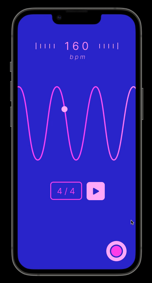
To make a more beginner-friendly, appealing metronome, I decided to deviate from the mechanical, ‘tech-y’, and mathematical look of my predecessors. Instead, I wanted to use visuals that were more natural, something that relied on our intuitive grasp of motion physics.
I came up with the notion of using a wave, squeezing and stretching according to the beats-per-minute (BPM). The beat would lie at the top of each wave, and the dot would visually and audibly pulse when it reached each crest.
The first iteration of WAVE was made in December 2020. I was excited to add all the things I wanted in a metronome, so that included a beat machine page.


Design process (pt. 2)
In August 2022, I came back to this project due to my slight annoyance at some features. My 2020 self hadn’t considered some things.
All the buttons on the main page were pretty small. One would be bound to accidentally press the ‘tap’ button instead of the play button, and vice versa. That row of buttons also wouldn’t pass the blurry eye test.
There was also really no need for a beat machine. If I was striving for simplicity, it was best that I left that to Garageband, whose beat machine I had imitated anyway. This left me with a single screen app, which went back to the goal of being beginner-friendly.


Conclusion
I had a lot of fun designing the metronome of my dreams, and I next would like to learn motion design and app development to get this out!
